Thursday, 23 May 2024

Research Task Nine : Target Audience Research And Analysis

I conducted research into the interests in both music and music magazines of 16-25 with 18 people surveyed with the majority being 16-18 with only 4 18-21 and 3 21-25 which, while on a limited scale, allows for me to see the interests and desires of my target audience. The survey spanned from primary music interests and how they access music to wishes for a new music magazine and features that would interest them in a subscription. This helps to influence my production of many aspects of my independant music magazine as I am able to understand the interests of my target audience to best manufacture my product to them.

It's clear that the most popular genre of music is Pop with 33.3% of answers being this genre. It's important to note that participants were able to select multiple genres of interest and while 13/18 participants identified pop as one of their favourite music genres, they also have other interests. Not only is pop very popular in the younger demographic, but rock and indie/alternative music also has a clear audience that may be able to be specifically targeted through a product. While it's evident there's a large market for a Pop magazine, it's key to understand that magazines can be crafted to target a specific demographic depending on their interests so having an interest in rock, metal and indie allows for a market to promote a magazine to.

The favoured genres is again reflected in the genres which participants would want to see in a new music magazine. There's clearly a large interest in pop music magazines, if they were to purchase a new magazine but 21.4% would be engaged by a rock/metal or indie magazine if it were to be produced. Both of these results help to influence my previous knowledge of the interests of my demographic and allow for a greater understanding into the desires of those who my magazine would be directly targeted towards.

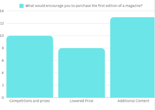
The survey also enabled me to gain a greater understanding of how to engineer my product to capture the interests of my target demographic. By accumulating data into the extra additions which would interest them to purchase the first edition of a new music magazine or a subscription service as well as the pricing to make the magazine appealing.

The majority of participants (13) were willing to pay £5 or more for a music magazine which is a reasonable price that not only allows to compete effectively with the competition but also to attract enough consumers to maintain a profit. The prices they would pay for a magazine reflects the fact that a large amount of the demographic will still be in education and therefore may not have the ability to spend a great amount of their money on such a product and so this leads them to prefer a lower, yet still reasonable price for a magazine.

                    
This idea of price as a key point of interest when looking at how to best market the product to my target audience becomes more apparent through the 8 participants who said that a lowered price for the first edition would encourage them to purchase the magazine. This allows for them to see the content offered by the magazine without paying the full price and may influence them to continue purchasing the magazine if it interests them. The results also showed the influence of additional content such as CDs and Posters to provide an extra incentive for consumers to purchase the magazine, again to hook them in order to gain a larger long-term audience. Concert tickets and competitions also appeared to be a useful incentive as many participants attended concerts/gigs so the opportunity to win tickets to these events would be another way to increase the number of readers for the first edition.
Another feature which most, if not all, independent music magazines utilise is a subscription service. These allow for an additional method of gaining profit apart from physical sales and advertisement as so for magazines without funding they're useful in order to maximise the profit created. Therefore, I made sure to understand what would encourage consumers to subscribe to a magazine. There seems to be quite a wide variety of ways in order to entice readers to subscribe to the magazine but the inclusion of additional content (especially posters) seems to be a great incentive for this type of service. A direct delivery also appeared to be a popular ammenity as it allows an ease of attaining the product, whereas it may be unlikely for consumers to often find themselves in a location where they're able to purchase a magazine which would dimish the sales of the product.

I also believed it to be essential to understand the type of content which would interest consumers of the demographic to hopefully engage them and convince them to purchase the magazine. In order to effectively carry this out I looked into the ways participants access music, their interests in concerts and how they access news regarding music. 100% of participants used streaming services with only 3 using other physical forms on occassion to listen to music and therefore it allows me to understand how to best promote these types of services to try and engage and interests audiences rather than attempting to create content based on other forms which wouldn't resonate with an audience. Moreover, the results show a clear interest in concert and gigs and even those who don't attend any are likely to only do so due to an inability to attend such events. Therefore, this shows a clear desire for content regarding such events so a section or coverlines dedicated to these would help to gain a greater audience interest in the magazine. Furthermore, all 18 participants use social media in order to access their music news so by crafting my magazine to be somewhat similar in style to the format of these sources it may help to maintain engagement for these audiences and allow a greater number of consumers for my product.


Friday, 17 May 2024

Reflection Point : What Have I Learned About Independent Music Magazine Websites?

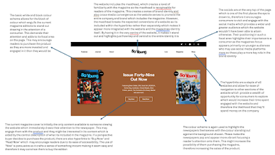
 Independent music magazine websites usually serve the purpose of extending and reinforcing the brand identity established in the magazine itself as well as using cross-media convergence. The masthead is usually central to the website itself and features in a prominent area of the website usually the primary optical area or at the top of the main page. This allows for instant recognition with long-time viewers as well as obviously linking the website to the magazine which means that the audiences of each media product will transfer over to all other components of the media company. Most music magazine websites feature their current edition in a prime area within the website usually appearing at the top of the main page. This allows for the magazine to engage with users of the website which may increase the likelihood of them purchasing the magazine and contributing money to the brand. A majority of independent music magazines share a similar colour scheme throughout their entire website which makes the brand instantly recognisable for a long-term audience with an understanding of the identity the brand presents. For newer consumers it becomes easily understood and they create a level of recognition with the brand. To emphasise the cross-media convergence, the socials are usually featured at the top of the main page so they are seen by consumers of the website. This increases their likelihood to engage with their social media which spreads their content and brand to a wider audience allowing for them to possibly gain more profits through the increased audience.

Independent music magazine websites appear to have a focus on making sure the website is easily digestible and navigable in order to capitalise on the time users spend engaged with it. The use of a search bar in most websites allows for consumers to specifically find information which appeals to them and may engage them as by seeing content about their interests it may entice them to look into other stories by the magazine. Websites which don't follow these conventions such as 'So Young' use it as a strength making their website easily navigable but making it so users have to view other stories in order to find their interest increasing their engagement and also the chance they will engage with other stories. The websites utilise hyperlinks in order to make the other notable sections of the website stand out to consumers increasing the time they'll spend engaged and captivated with the website increasing the chance they contribute to the brand in any way. The stories on the front page are usually broken down into sections, much like a contents page to make it recognisable, especially for audiences with limited knowledge of technology. This capitalises off of their knowledge of magazine and creates another element of cross-media convergence with the main pages often mirroring the house style used for the contents page. This means that consumers will be able to find their way through the stories in order to find something which interests them, boosting their likelihood to stay engaged with the website and to return to it.

As with most products, magazine websites maintain their focus of gaining a profit which is central to the whole identity and production of these sites. One way that magazines create profit is through physical sales so through the advertisement of the current edition, and often past editions, they maximise the viewership their product will receive increasing the chances that consumers will purchase it. The other way they can gain profit is through advertisements which are used throughout all of the websites. These usually have a link to the interests of those who would be engaged with the website and feature in prominent spots in order to entice brands looking into advertising. Independent music magazines also consistently advertise their subscription services, whether this be on advertisements or by placing them in prominent areas which attract the attention of viewers. This allows for them to maximise the number of readers who will purchase a subscription which again provides a boost in their profits which is a primary aim of the entire company not just the website.


Friday, 10 May 2024

Research Task Seven : Independent Music Magazine Websites


The Wire has elements we would expect from an online website for magazines such as its use of advertisements and hyperlinks. The use of hyperlinks is key to an effective experience as it allows for ease of navigation across a website. These hyperlinks serve to transfer consumers to other sections of the website which may peak their interests or provide them with more content or information regarding the magazine. The placement of these hyperlinks in an obvious location allows for them to be utilised to their maximum potential making them easy and effective for a reader. Advertisements are expected within all magazine and newspaper websites as they rely on physical sales and advertisements in order to make a profit, therefore these adverts are placed in prime spots within the website so that companies wishing to purchase a slot will be satisfied it is worth the cost. These adverts also appeal to the audience who the magazine appeals to so that it is more likely they'll be tempted by the product which is advertised. Subscriptions are also used to increase profits and so there are lots of advertisements for their service whether it be the specific hyperlink, the subscriber login, or the adverts dedicated to it. This means it is more likely that consumers will subscribe to the magazine which would again provide them a financial gain.

The ease of navigation and ability to digest the website seems very central to its design and is incorporated into each and every section of the wesbite. Throughout the home page and the hyperlinked sections, the website has some sort of search function or one which narrows the items shown to an audience. This allows them to tailor their experience on the website to their own interest and means that they're more likely to spend more time engaged with the website increasing the likelihood they choose to contribute to the magazine in some way. The way all of the sections are laid out is easy to digest meaning that audiences can understand what is being presented to them as they navigate the website.The type of media presented (video, interview, tracks etc.) for each story clearly shown at the top of each story on the home page. Furthermore, the past editions and upcoming events are ordered chronologically, as would be expected making it easier for an audience to navigate through these sections and find the content which they are looking for or something which interests them.

To add to their sense of brand identity, the website features much cross-media convergence and aligns itself heavily with the magazine. There are many references and links on the website to other media products produced by the magazine whether it be their radio show, CDs, Socials, Newsletter or magazine which all feature at some point on the website. Although, the socials would normally be featured at the very top of the homepage, yet they only appear when you scroll down further or in seperate sections which suggets that the Wire isn't so engaged with their socials and instead sees it as another asset to their brand yet not a major one. The brand identity with the magazine is heavy with the website featuring a masthead of the same font and style which makes it immediately recognisable to a reader of the magazine and makes the link between the two products easily understandable. Moreover, the magazine has a prominent role within the website featuring at the very top of the home page and again on many of the hyperlinked sections which constantly reminds consumers of the magazine publication which may make it more likely for them to purchase a copy or a subscription due to its continual exposure to them.

Tuesday, 7 May 2024

Reflection Point : What Have I Learnt About Magazine Contents Pages?

 Magazine contents pages usually feature an obvious reference to the coverlines featured on the front page as they will usually have engaged readers meaning they then go to have a look at the contents page to decide whether or not to purchase it. Therefore, by presenting these obviously it allows a consumer to clearly locate where in the magazine these are while also seeing all the other content offered by the magazine at the same time. The coverlines of these content pages usually appear in stark contrast and stand out from the background to allow readers to see the content which will entice and engage them to increase the overall sales of the magazine.

These contents pages usually feature images related to a key story to further interest the reader by drawing their attention and focus to this image. It allows for the magazine to highlight one coverline to the audience and to further engage potential consumers who are unsure if they wish to purchase the magazine. On occasion, the colour scheme of the contents page mirrors that of the main image to further integrate it into the page, however the majority of the time its similar throughout whether that be a house style or representative of the masthead which allows the magazine to be easily recognisable for returning audiences.

The contents pages are usually structured by the coverlines in the order that they appear in the magazine which provides a sense of familiarity as the chronology makes the layout easily understandable for an audience. Moreover, the contents page essentially acts as a hub for the chosen coverlines it highlights and through the integration of page numbers it serves as a page that consumers can return to in order to navigate to the content that engages them the most. The content page is necessary to fulfil the purpose of a magazine where audiences are likely to consume only the media which engages them most and through this section they can easily locate these coverlines.

Research Task Six : Wider Research Into Magazine Contents Pages

                                                     MOJO contents page


InStyle contents page


Friday, 3 May 2024

Research Task Five : The Wire Music Magazine Contents Pages


Reflection Point : What Have I Learned About Independent Music Magazine Front Covers?

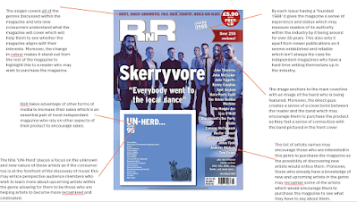
 In all of the independant magazine covers I looked at ('RnR' and 'The Wire') the masthead remained stationary at the top of the page. This allows for the magazines to remain recognisable for a continual audience especially when they are in shops competing with many other magazines on shelves. However, 'The Wire' changes the colour of their masthead depending on the edition, whereas 'RnR' keeps it the same, this is just a house style of both magazines but it's important to see the different options for the masthead of an independant magazine. The mastheads of the two magazines also maintain the same sans-serif font which allows them to be bold and stand out in a storefront against the many other competitors. They also use anchorage between their main coverline and their main image which helps to familarise an audience with these understanding of these and upcoming artists who they may be unaware of. This allows for the magazine to carefully craft the main image and main coverline in order to suggest a certain message or idea about the artists to the audience. 

Furthermore, to make their magazines more recognisable and distinct to audiences, both magazines maintain features of their front cover throughout editions. 'RnR' has the list of reviewed artist alongside the right side of their cover, while the wire keeps its coverlines in one of the corners of the page so they are easily identifiable for a consumer who wants to find out more about the specific edition. This allows them to become more recognisable for a continued audience but also to engage perspective readers through the consistency that they can come to expect from the magazine.

As expected from independant magazines, both 'The Wire' and 'RnR' make reference to the other media products that they produce on their front cover. Although these are more clear on 'RnR' with the use of puffs and text in the recency optical area to catch an audience's attention, this can also be found on the covers of 'The Wire'. This is essential for independant magazines as a lot of the time the sales aren't enough to sustain their production and so they look into other methods in order to entice consumers and also to promote their brand which both magazines do by providing playlists of music for their audiences.

Thursday, 2 May 2024

Research Task 4: How does 'RnR' Magazine's Front Cover Appeal To Audiences?


Both texts keep the masthead stationary within the primary optical area which means that a consistent customer would be able to instantly recognize the brand even when it is in a shop competing with many other magazines. Furthermore, both front covers keep the skyline with contrasting colours which highlights to a new consumer the genres covered by the magazine so those who are interested in that type of music will be able to see that the content will interest them and therefore entice them to purchase the magazine. The use of photos of the artists is consistent throughout all of the covers and creates anchorage between the main coverline and the main image which can help to familarise audiences with the artist or to help them to be recognisable to those who are informed about their work. This works well especially when they are introducing new artists or 'underground' artists as it provides a level of understanding even without reading any of the contents of the magazine.

Production Task One : Photography

 In order to realise the idea of my first edition, which was focused on an upcoming star who produced from his bedroom, I decided to create ...