


The Wire has elements we would expect from an online website for magazines such as its use of advertisements and hyperlinks. The use of hyperlinks is key to an effective experience as it allows for ease of navigation across a website. These hyperlinks serve to transfer consumers to other sections of the website which may peak their interests or provide them with more content or information regarding the magazine. The placement of these hyperlinks in an obvious location allows for them to be utilised to their maximum potential making them easy and effective for a reader. Advertisements are expected within all magazine and newspaper websites as they rely on physical sales and advertisements in order to make a profit, therefore these adverts are placed in prime spots within the website so that companies wishing to purchase a slot will be satisfied it is worth the cost. These adverts also appeal to the audience who the magazine appeals to so that it is more likely they'll be tempted by the product which is advertised. Subscriptions are also used to increase profits and so there are lots of advertisements for their service whether it be the specific hyperlink, the subscriber login, or the adverts dedicated to it. This means it is more likely that consumers will subscribe to the magazine which would again provide them a financial gain.
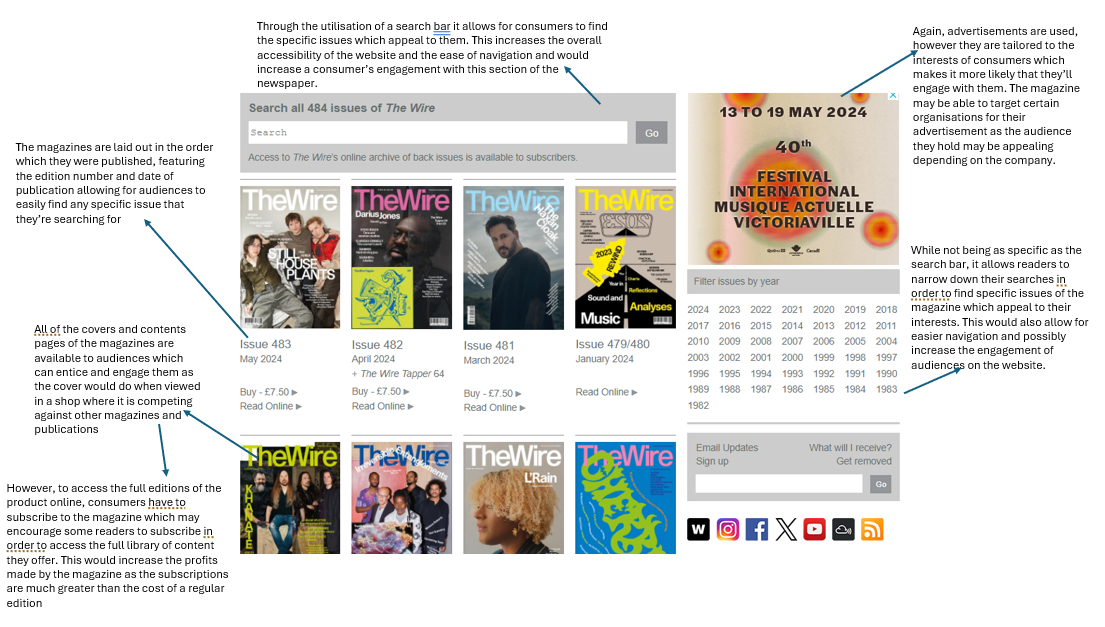
The ease of navigation and ability to digest the website seems very central to its design and is incorporated into each and every section of the wesbite. Throughout the home page and the hyperlinked sections, the website has some sort of search function or one which narrows the items shown to an audience. This allows them to tailor their experience on the website to their own interest and means that they're more likely to spend more time engaged with the website increasing the likelihood they choose to contribute to the magazine in some way. The way all of the sections are laid out is easy to digest meaning that audiences can understand what is being presented to them as they navigate the website.The type of media presented (video, interview, tracks etc.) for each story clearly shown at the top of each story on the home page. Furthermore, the past editions and upcoming events are ordered chronologically, as would be expected making it easier for an audience to navigate through these sections and find the content which they are looking for or something which interests them.