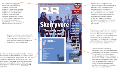
Both texts keep the masthead stationary within the primary optical area which means that a consistent customer would be able to instantly recognize the brand even when it is in a shop competing with many other magazines. Furthermore, both front covers keep the skyline with contrasting colours which highlights to a new consumer the genres covered by the magazine so those who are interested in that type of music will be able to see that the content will interest them and therefore entice them to purchase the magazine. The use of photos of the artists is consistent throughout all of the covers and creates anchorage between the main coverline and the main image which can help to familarise audiences with the artist or to help them to be recognisable to those who are informed about their work. This works well especially when they are introducing new artists or 'underground' artists as it provides a level of understanding even without reading any of the contents of the magazine.

