




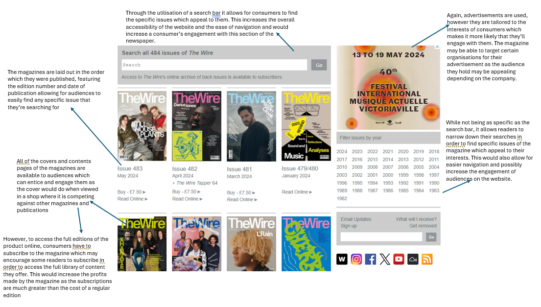

The Wire has elements we would expect from an online website for magazines such as its use of advertisements and hyperlinks. The use of hyperlinks is key to an effective experience as it allows for ease of navigation across a website. These hyperlinks serve to transfer consumers to other sections of the website which may peak their interests or provide them with more content or information regarding the magazine. The placement of these hyperlinks in an obvious location allows for them to be utilised to their maximum potential making them easy and effective for a reader. Advertisements are expected within all magazine and newspaper websites as they rely on physical sales and advertisements in order to make a profit, therefore these adverts are placed in prime spots within the website so that companies wishing to purchase a slot will be satisfied it is worth the cost. These adverts also appeal to the audience who the magazine appeals to so that it is more likely they'll be tempted by the product which is advertised. Subscriptions are also used to increase profits and so there are lots of advertisements for their service whether it be the specific hyperlink, the subscriber login, or the adverts dedicated to it. This means it is more likely that consumers will subscribe to the magazine which would again provide them a financial gain.
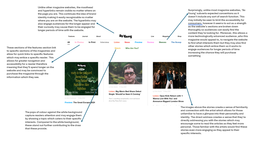
The ease of navigation and ability to digest the website seems very central to its design and is incorporated into each and every section of the wesbite. Throughout the home page and the hyperlinked sections, the website has some sort of search function or one which narrows the items shown to an audience. This allows them to tailor their experience on the website to their own interest and means that they're more likely to spend more time engaged with the website increasing the likelihood they choose to contribute to the magazine in some way. The way all of the sections are laid out is easy to digest meaning that audiences can understand what is being presented to them as they navigate the website.The type of media presented (video, interview, tracks etc.) for each story clearly shown at the top of each story on the home page. Furthermore, the past editions and upcoming events are ordered chronologically, as would be expected making it easier for an audience to navigate through these sections and find the content which they are looking for or something which interests them.
Magazine contents pages usually feature an obvious reference to the coverlines featured on the front page as they will usually have engaged readers meaning they then go to have a look at the contents page to decide whether or not to purchase it. Therefore, by presenting these obviously it allows a consumer to clearly locate where in the magazine these are while also seeing all the other content offered by the magazine at the same time. The coverlines of these content pages usually appear in stark contrast and stand out from the background to allow readers to see the content which will entice and engage them to increase the overall sales of the magazine.
These contents pages usually feature images related to a key story to further interest the reader by drawing their attention and focus to this image. It allows for the magazine to highlight one coverline to the audience and to further engage potential consumers who are unsure if they wish to purchase the magazine. On occasion, the colour scheme of the contents page mirrors that of the main image to further integrate it into the page, however the majority of the time its similar throughout whether that be a house style or representative of the masthead which allows the magazine to be easily recognisable for returning audiences.
The contents pages are usually structured by the coverlines in the order that they appear in the magazine which provides a sense of familiarity as the chronology makes the layout easily understandable for an audience. Moreover, the contents page essentially acts as a hub for the chosen coverlines it highlights and through the integration of page numbers it serves as a page that consumers can return to in order to navigate to the content that engages them the most. The content page is necessary to fulfil the purpose of a magazine where audiences are likely to consume only the media which engages them most and through this section they can easily locate these coverlines.


In all of the independant magazine covers I looked at ('RnR' and 'The Wire') the masthead remained stationary at the top of the page. This allows for the magazines to remain recognisable for a continual audience especially when they are in shops competing with many other magazines on shelves. However, 'The Wire' changes the colour of their masthead depending on the edition, whereas 'RnR' keeps it the same, this is just a house style of both magazines but it's important to see the different options for the masthead of an independant magazine. The mastheads of the two magazines also maintain the same sans-serif font which allows them to be bold and stand out in a storefront against the many other competitors. They also use anchorage between their main coverline and their main image which helps to familarise an audience with these understanding of these and upcoming artists who they may be unaware of. This allows for the magazine to carefully craft the main image and main coverline in order to suggest a certain message or idea about the artists to the audience.
Furthermore, to make their magazines more recognisable and distinct to audiences, both magazines maintain features of their front cover throughout editions. 'RnR' has the list of reviewed artist alongside the right side of their cover, while the wire keeps its coverlines in one of the corners of the page so they are easily identifiable for a consumer who wants to find out more about the specific edition. This allows them to become more recognisable for a continued audience but also to engage perspective readers through the consistency that they can come to expect from the magazine.
As expected from independant magazines, both 'The Wire' and 'RnR' make reference to the other media products that they produce on their front cover. Although these are more clear on 'RnR' with the use of puffs and text in the recency optical area to catch an audience's attention, this can also be found on the covers of 'The Wire'. This is essential for independant magazines as a lot of the time the sales aren't enough to sustain their production and so they look into other methods in order to entice consumers and also to promote their brand which both magazines do by providing playlists of music for their audiences.

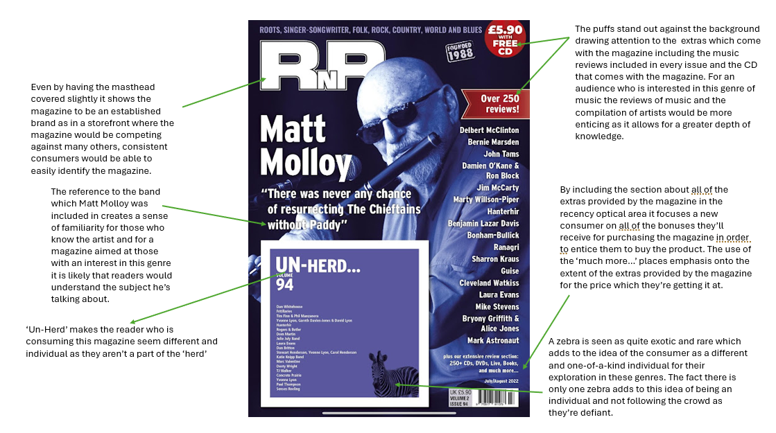
Both texts keep the masthead stationary within the primary optical area which means that a consistent customer would be able to instantly recognize the brand even when it is in a shop competing with many other magazines. Furthermore, both front covers keep the skyline with contrasting colours which highlights to a new consumer the genres covered by the magazine so those who are interested in that type of music will be able to see that the content will interest them and therefore entice them to purchase the magazine. The use of photos of the artists is consistent throughout all of the covers and creates anchorage between the main coverline and the main image which can help to familarise audiences with the artist or to help them to be recognisable to those who are informed about their work. This works well especially when they are introducing new artists or 'underground' artists as it provides a level of understanding even without reading any of the contents of the magazine.

