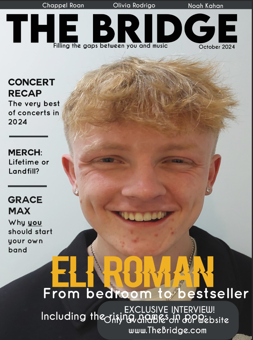
After beginning to work on my first front cover, I decided to switch the masthead design which I would use on my magazine due to the fact that the initial masthead would be less effective as a magazine due to it's longer name which also subverted generic conventions of magazine mastheads. Moreover, when put onto my magazine front cover, it appeared too bulky or took up too much space within the cover meaning that less additional furniture could be added to the cover.
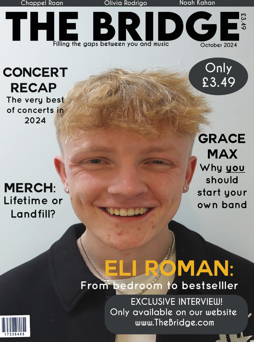
I chose to change the masthead title to 'The Bridge' which makes reference to the idea of a bridge within many music genres such as within the verse-chorus structure favoured in pop music, which links to the genre of my magazine. The Bridge/Middle 8 is usually the section of the song which differentiates itself most from the sound established throughout the verses and choruses and therefore it creates the idea of the magazine as something different or special. Furthermore, this continues to support the idea of my magazine as revealing the behind the scenes aspects or inner workings of pop music with it almost bridging the gap between the consumer and the music artists allowing the audience of the magazine to gain a deeper understanding. This is further reinforced by my strapline, 'Filling the gaps between you and music' which again plays into the idea of linking the audience and the music industry with the second person personal pronoun, 'you' directly involving and linking the audience into the magazine and what it produces.
This is what my masthead and strapline will look like on my magazine editions with Caviar dreams bold as the font

My first front cover includes a male model who is acting as 'Eli Roman' the featured artist within my first edition and is within an inside setting.


This was my initial first cover, however I decided upon speaking with others in my target demographic to change aspects in order for it to appeal to a greater audience and to conform more to the conventions of a typical music magazine such as through making the masthead more prominent within the front page.