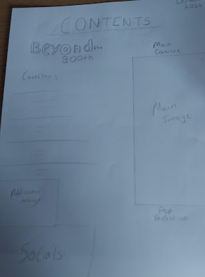
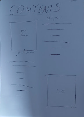
I initially experimented with two seperate designs for my Contents page one with two images of similar sizes and one with a larger main image and then an additional secondary image. I preferred the second option as it allows for the main coverline to still stand out on the contents page while also allowing for more additional coverlines and other features of the contents page to be added. The initial idea which I didn't use is shown at the top followed by a mock up of the first contents page and then one of the second edition with the coverlines and sections included.

This mock up shows how a contents page for the second edition could look with a different main image being used for the main coverline, however keeping it as a focal point for the magazine with it dominating the page. This also shows of the other coverlines that would be featured on the front page and allows for an image to anchor one of those coverlines, in this case 'Vinyl Records: Just a craze or here to stay?' This mockup also allows for an additional 'Pop Perfection' section which gives readers another story to look forward to in each addition as it would be a reoccuring list within each addition. The socials where audiences could contact the magazine would be included so that they would be easily found. Furthermore, the page numbers for each coverline are clearly placed next to them so that readers can find any story which they are interested in quickly without having to go through the whole magazine.

