Masthead and Strapline in Quicksand bold

Masthead in Infinity and Strapline in Chantelle
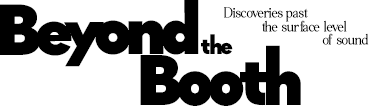
Strapline and Masthead (partially) in Caviar dreams and Masthead also in Infinity
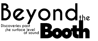
As my masthead is longer than the majority of magazine masthead's, I've used two separate lines in order to position it in the space available at the top of the magazine front cover. With the separation between the two parts of the masthead I decided to experiment with different fonts for the separate parts in order to draw greater attention to the word 'Booth' through the contrast of the masthead. So that there would still be cohesion and not too many fonts, I kept the strapline in the same font as part of the masthead to make the magazine easy to digest. I also changed the positioning of the strapline from the top right corner to under the masthead to see where it seemed to fit better on the page and I eventually decided to leave it below the magazine as it seems to incorporate the strapline into the product more effectively as a whole.